Fact Sheets & Infographics
An infographic lives or dies on one question: does the reader get the point before they decide to stop reading? Across these pieces I took dense material — generative-AI research, enterprise network products, quarterly earnings — and turned it into clear, engaging visuals that carried a client's message and stayed true to their brand. Working with account and content leads on the messaging, I owned the design and execution — and, for the Spectrum work, delivered every piece as a fully tagged, accessible PDF.
Featured — Travel & Campaign Infographics
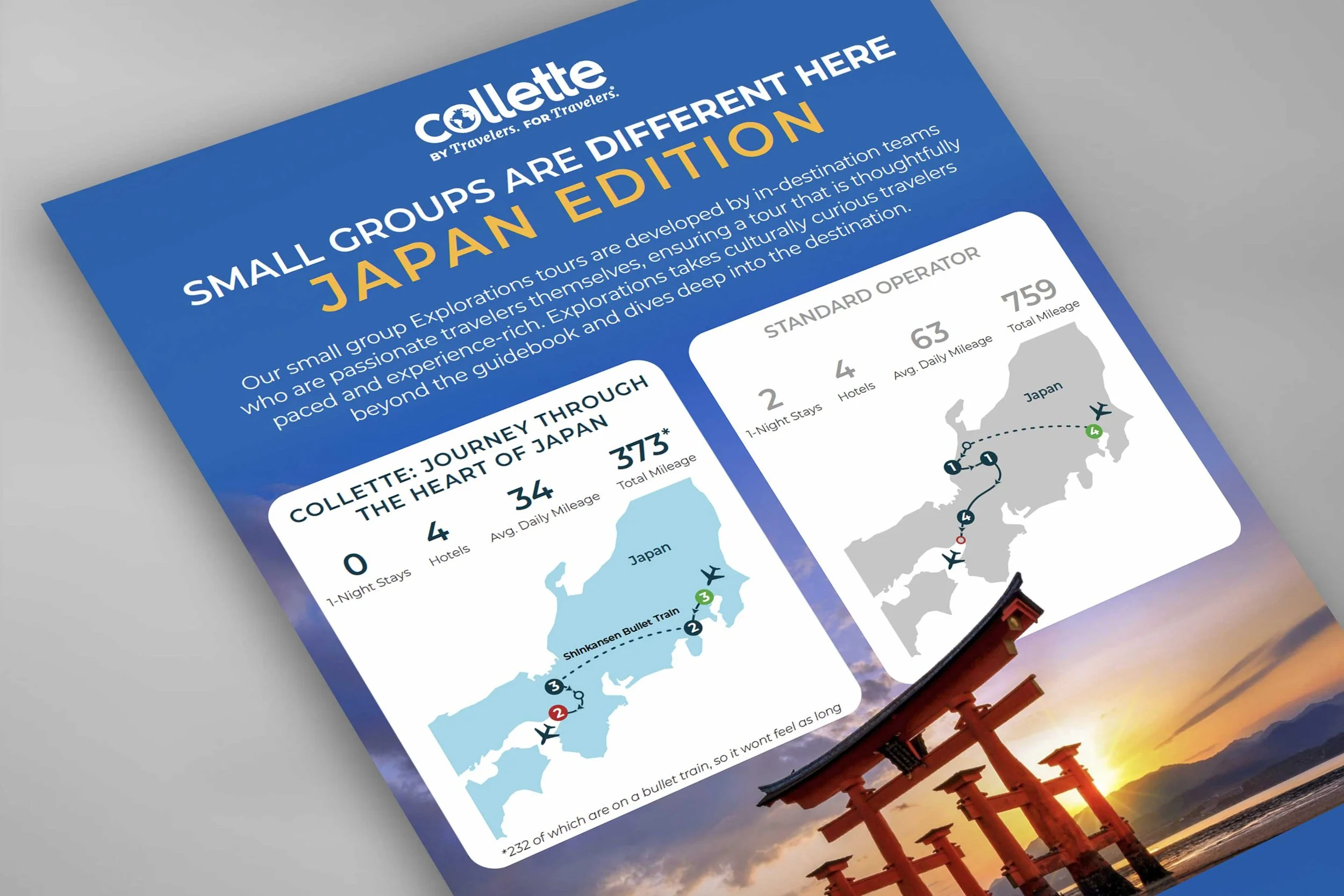
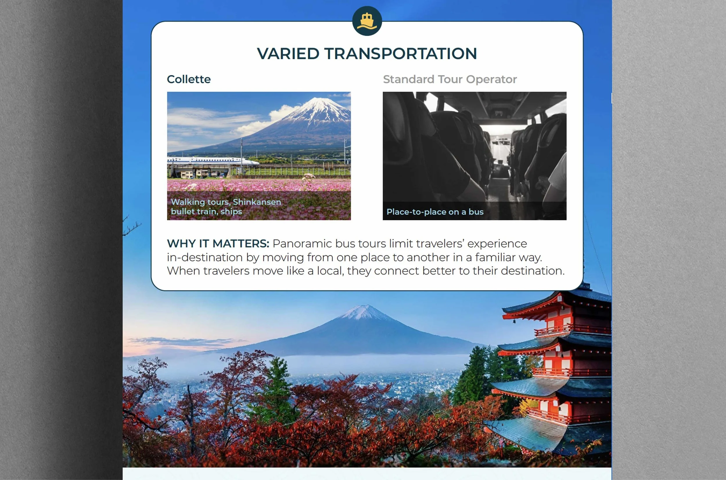
Collette | Scrolling Comparison Infographic
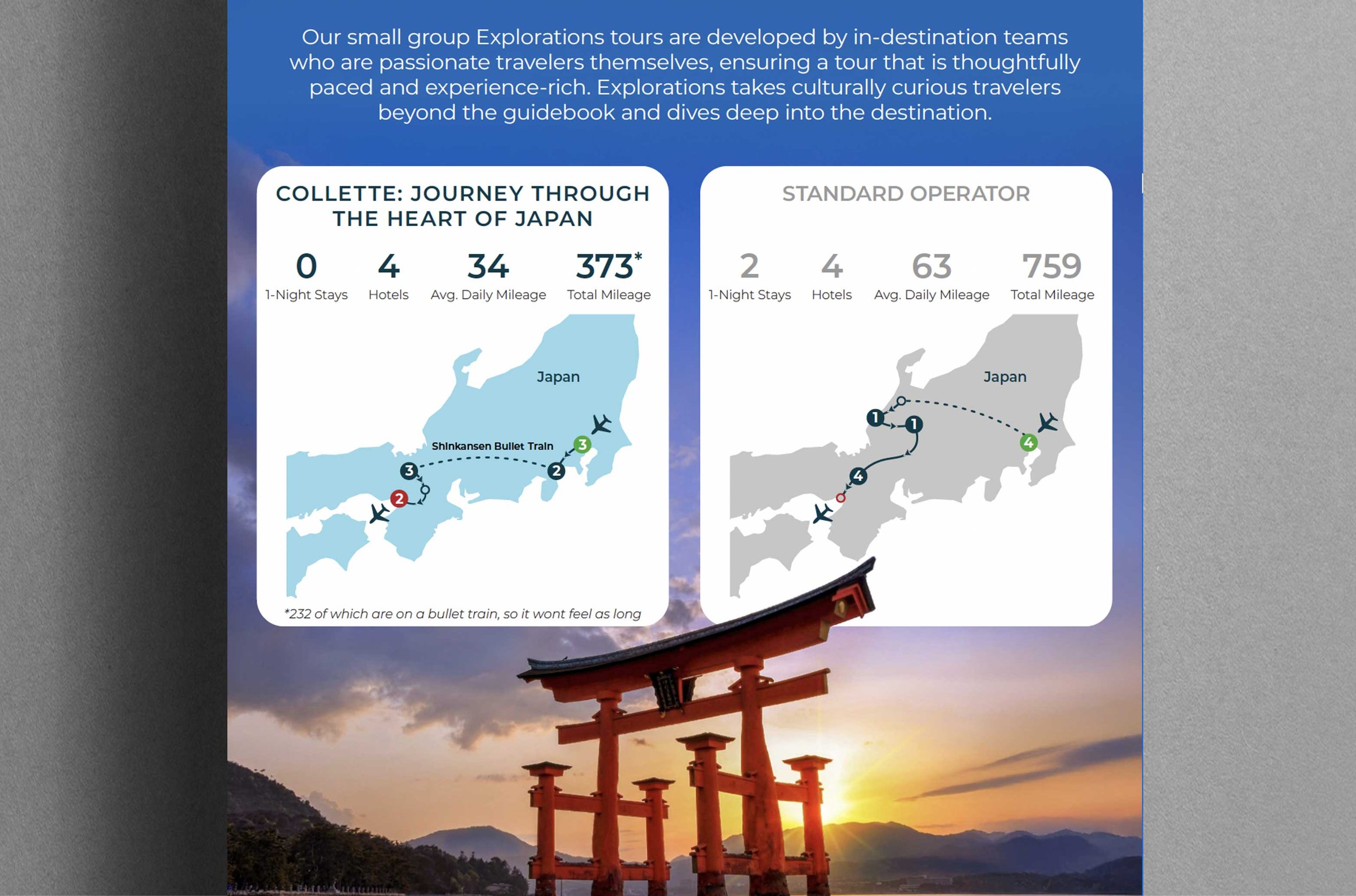
The goal: Make Collette's "we're different here" claim something a reader feels while scrolling, not a paragraph they have to be talked through. Part of the Small Group Explorations campaign, it compares a Collette small-group tour against a standard operator across the things that actually shape a trip — pacing, transportation, and cultural access.
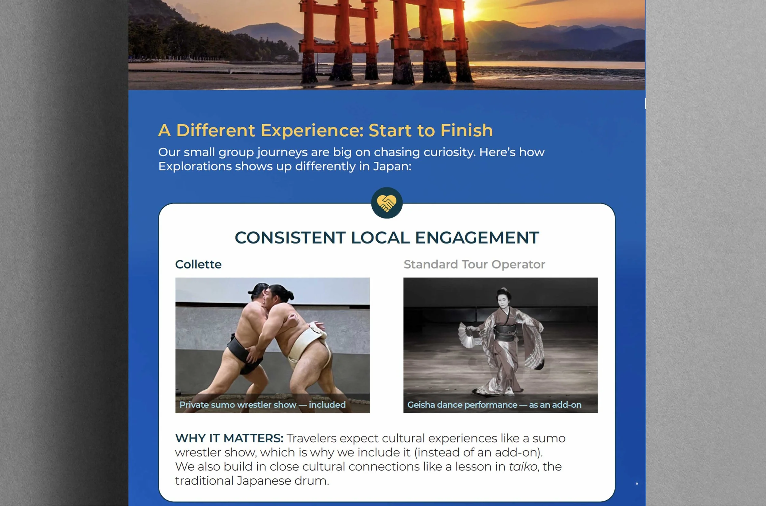
My role: I designed the structure and template for this piece — drawing on my experience building scrolling infographics for other clients to give the campaign a digital-native, long-form format that tells a richer story through scrolling than a static page could. I applied the comparison treatment I developed for the campaign (the desaturated-versus-vibrant device from the Travel Advisor Resource Guide), and integrated the campaign's existing route-map assets into the new scrolling framework.
The approach: Rather than squeeze a comparison onto one static page, I built a scrolling structure that lets dense content breathe — sectioned into scannable stat cards (one-night stays, hotels, mileage) and side-by-side "why it matters" callouts on local engagement and transportation. Standard-operator imagery runs flat and desaturated; Collette's runs vibrant and alive — so "different here" registers before a word is read.
The impact: The comparison treatment proved effective enough to carry across multiple pieces of the Small Group Explorations campaign, and this piece established a reusable digital scrolling format for long-form comparison content. Adobe InDesign / Illustrator / Photoshop
Technical & B2B Infographics: Making Complex Products Legible
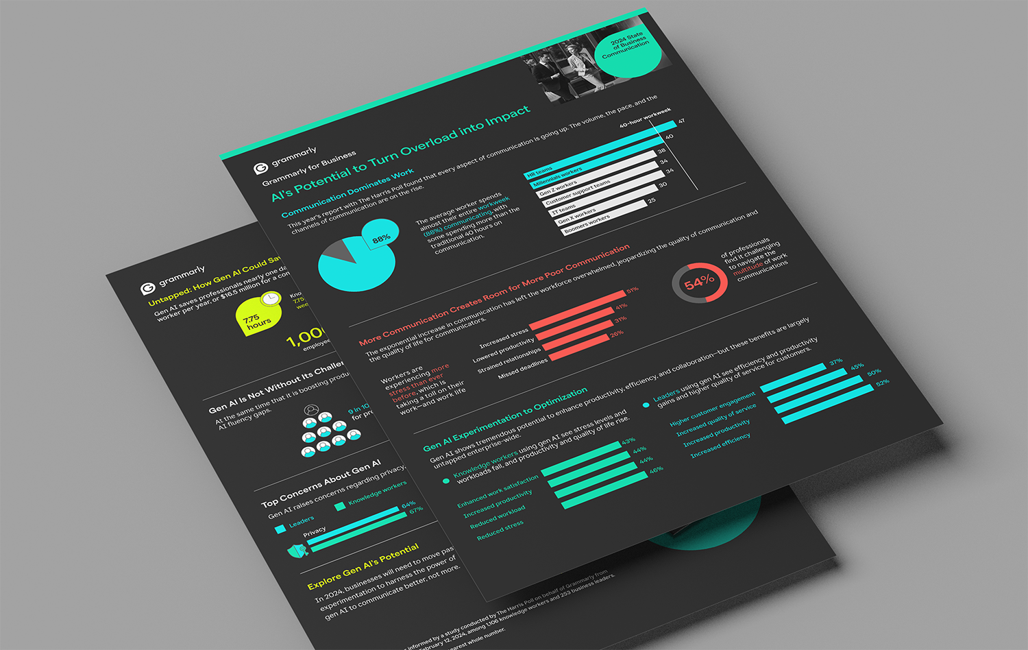
Grammarly | State of Business Communication Infographic
The visual companion to Grammarly's 2024 State of Business Communication report, translating research on generative AI's workplace impact into a shareable, at-a-glance story. I pulled the report's key findings into a hierarchy a reader could absorb in a scroll rather than a study session. Designed in Figma · Companion to a long-form research report

Spectrum Enterprise | Dedicated Internet (FIA) Infographic
Working from a concept developed with the account and content leads, I designed the execution: an HOV-lane visual that turns "dedicated high-speed internet" into an image a buyer gets instantly — your own uncongested lane while everyone else sits in traffic. Adobe InDesign / Illustrator / Photoshop · Concept-driven technical infographic • Tagged for Accessibility


Spectrum Enterprise | Hospitality Infographic
I designed a vertical hotel-facade layout that organizes Spectrum's hospitality products floor by floor, so a complex service stack reads as one intuitive building instead of a bulleted list — clear, engaging, and on-brand. Adobe InDesign / Illustrator / Photoshop · Concept-driven technical infographic • Tagged for Accessibility


Spectrum Enterprise | Higher Ed Infographic
An isometric campus layout maps Spectrum's services onto the places they actually serve — dorms, lecture halls, stadiums — making an enterprise offering feel specific to a college's world. Adobe InDesign / Illustrator / Photoshop · Concept-driven technical infographic • Tagged for Accessibility


Spectrum Enterprise | Higher Ed Fact Sheet
The companion fact sheet to the higher-ed campaign — the same story compressed into a scannable, sales-ready one-to-two-pager that holds the campaign's visual system. Adobe InDesign / Illustrator / Photoshop · Concept-driven technical infographic • Tagged for Accessibility


Financial & Corporate Communications: Investor-grade Clarity
Conagra Brands | Quarterly Earnings Infographic
Quarterly performance turned into a clear, credible visual — the kind of investor-facing piece where accuracy and restraint matter as much as design. I structured the quarter's key numbers so stakeholders could read the story at a glance without losing rigor. Adobe InDesign / Illustrator · Investor-facing earnings communication


Highview Capital | Two-pager
A two-pager presenting the fund's approach and portfolio with the polish and discretion a private-equity audience expects — dense fund information organized into a confident, skimmable spread. Adobe InDesign · Investor / corporate two-pager


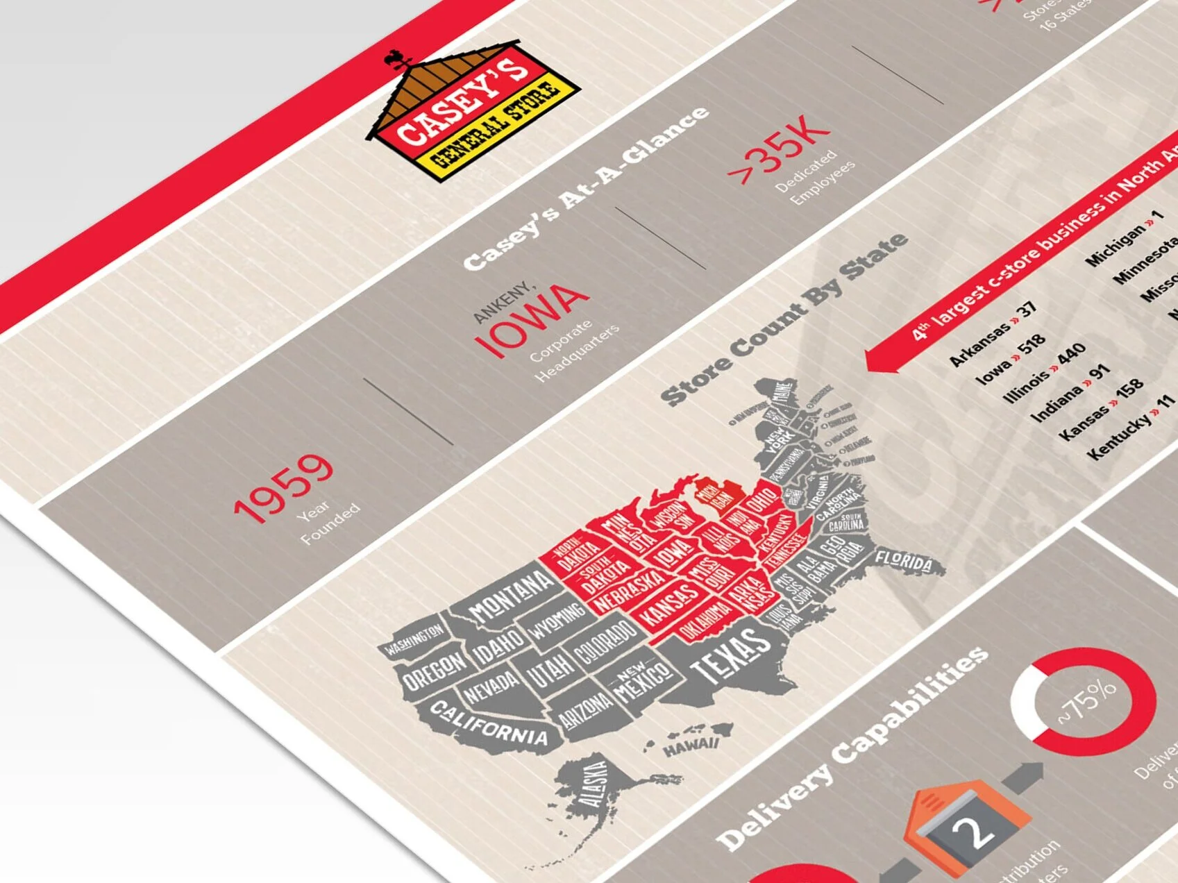
Casey’s General Store | Fact Sheet
A fact sheet distilling the company's business and capabilities into a single authoritative page — the reference document a company hands to stakeholders, designed for clarity and credibility. Adobe InDesign · Corporate fact sheet