
Ebooks & Long-Form Design
Long-form pieces are where brand, editorial pacing, and data all have to work together across 20-plus pages without losing the reader. Below are thought-leadership ebooks I designed for enterprise clients — each built in Figma, exported as a fully tagged, accessibility-compliant PDF, and rolled into a larger integrated campaign.
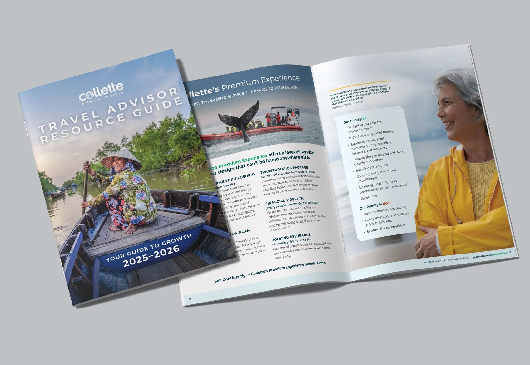
Collette | Travel Advisor Resource Guide 2025–2026
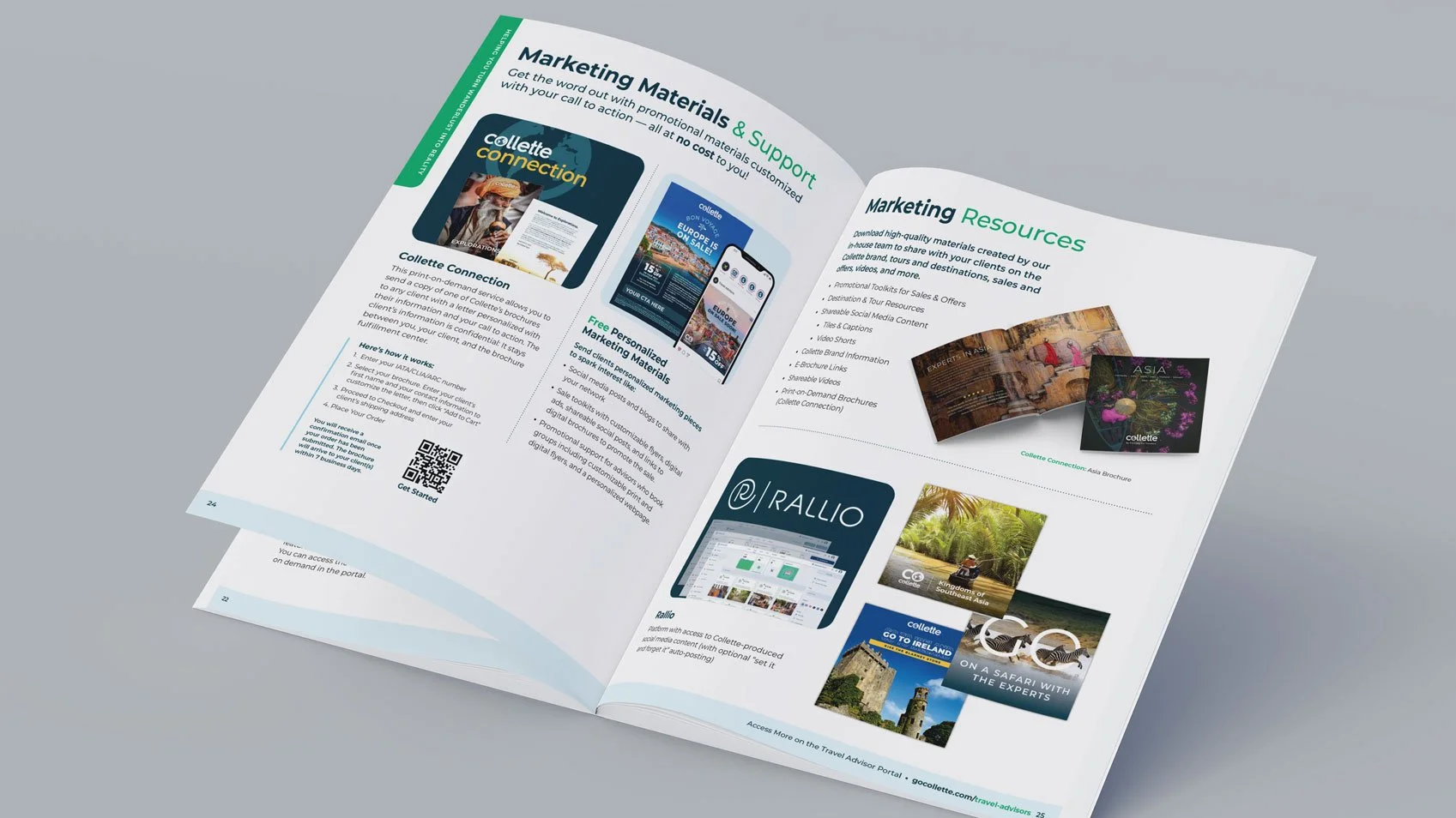
The goal: The Advisor Resource Guide is the definitive resource advisors use to learn how to partner with Collette — brand story, product philosophy, competitive differentiators, and the full stack of advisor tools (the Travel Advisor Portal, MyCollette, Collette University, the Travel Advisor Network, and loyalty and incentive programs). At 79 pages across print and digital, the challenge is keeping something that comprehensive consistent, navigable, and persuasive.
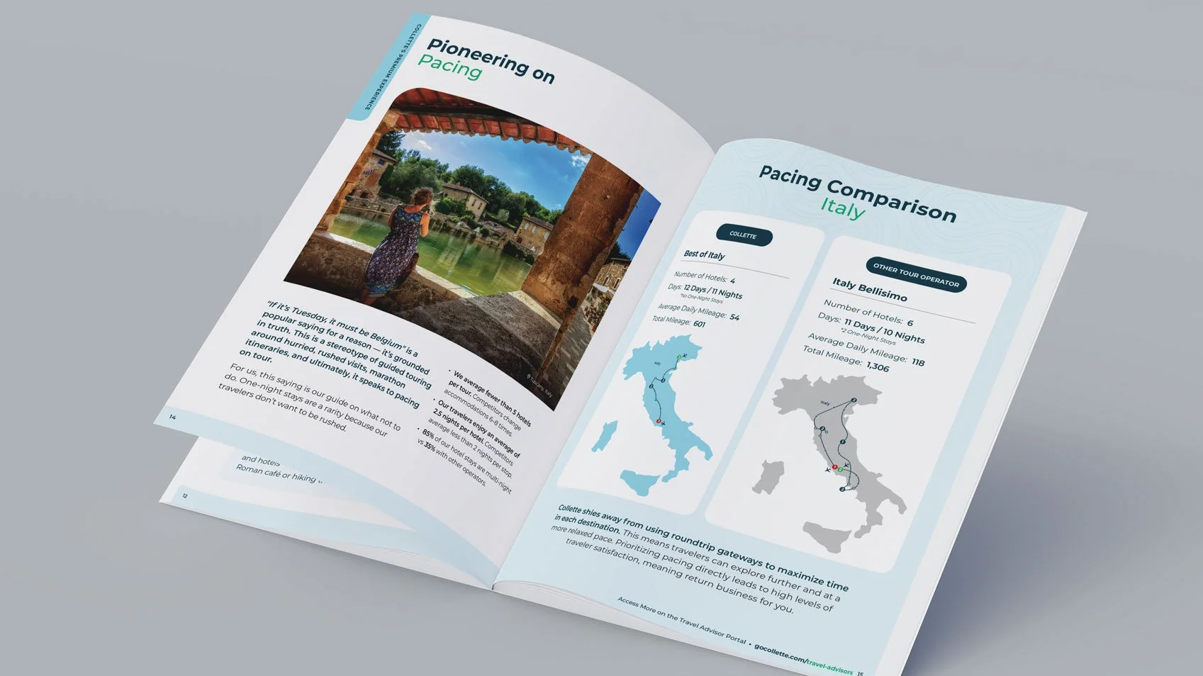
My role: As Collette's sole B2B designer, I produced the full 79-page print-and-digital edition — evolving the design system established by the previous art director, designing a color-coded section-tab navigation system, and creating a comparison treatment that was reused across our Small Group Explorations campaign.
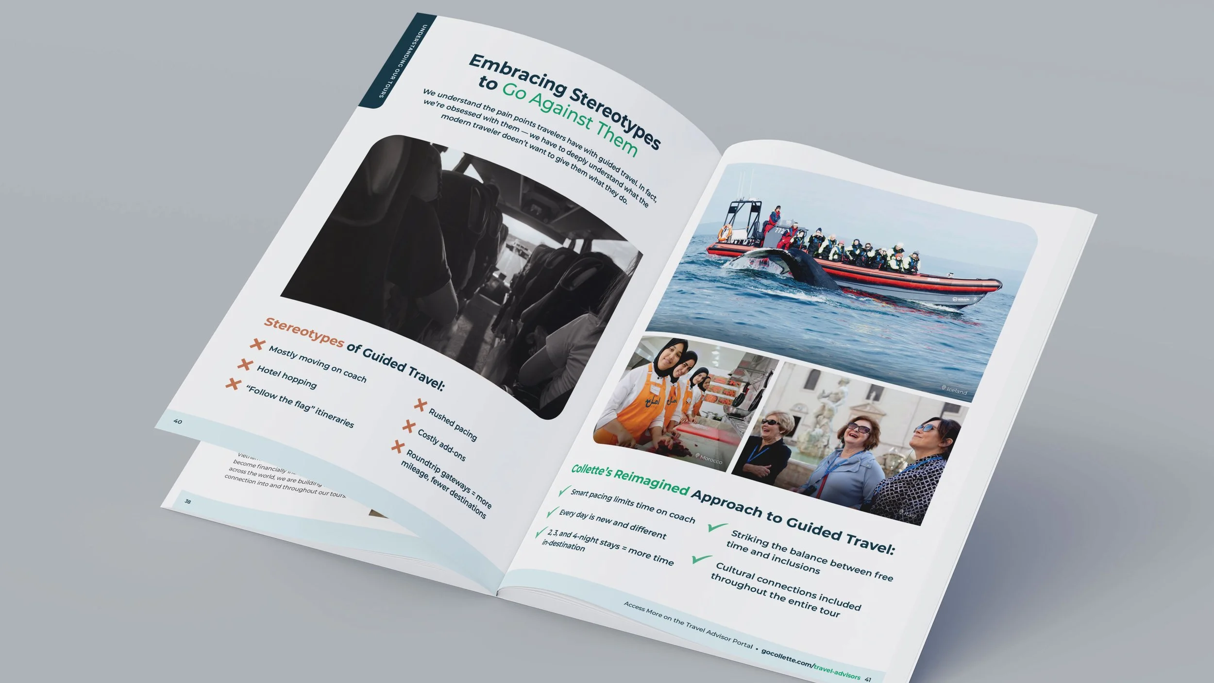
The approach: The piece I'm proudest of is a visual argument I designed to reframe how travelers see guided touring. To embody the tired stereotype — the coach, the hotel-hopping, the "follow the flag" rush — I treated imagery in desaturated black-and-white; to answer it, I paired vibrant Collette photography of small groups, host meals, and slower, intentional pacing, with a clean X-versus-checkmark structure that lets an advisor take in the contrast at a glance. The treatment worked so well it became a reusable system across the broader Small Group Explorations campaign. Across the rest of the 79 pages, I held one visual system together — typography, color, grid, and photography — and designed a color-coded section-tab system, keyed to the table of contents, so a reader always knows which part of a long guide they're in. I produced print and digital editions in parallel from a single InDesign file.
The impact: It's become one of the primary resources travel advisors who sell Collette rely on to learn how to work with the brand, and the comparison treatment I developed here carried across multiple pieces of the Small Group Explorations campaign.
The next chapter: The Resource Guide gives advisors the what — who Collette is and why it's different. But knowing the story isn't the same as knowing how to sell it. That gap is exactly what I designed the companion piece to close: The Guided Advantage, a selling playbook that turns all of this into tactics an advisor can use on the next client call.
Details: Designed in InDesign · 79-page guide, print + digital · Built on and evolved an established Collette design system · Comparison treatment reused campaign-wide
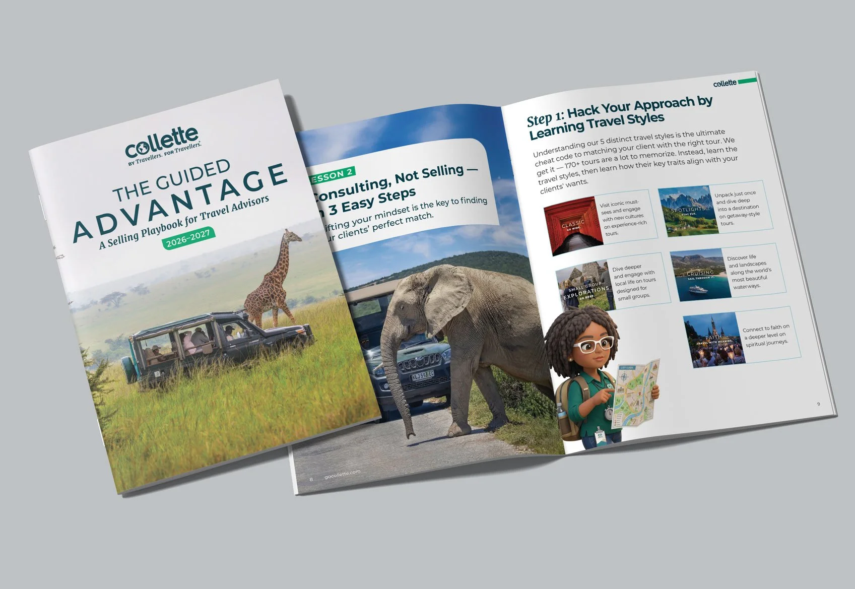
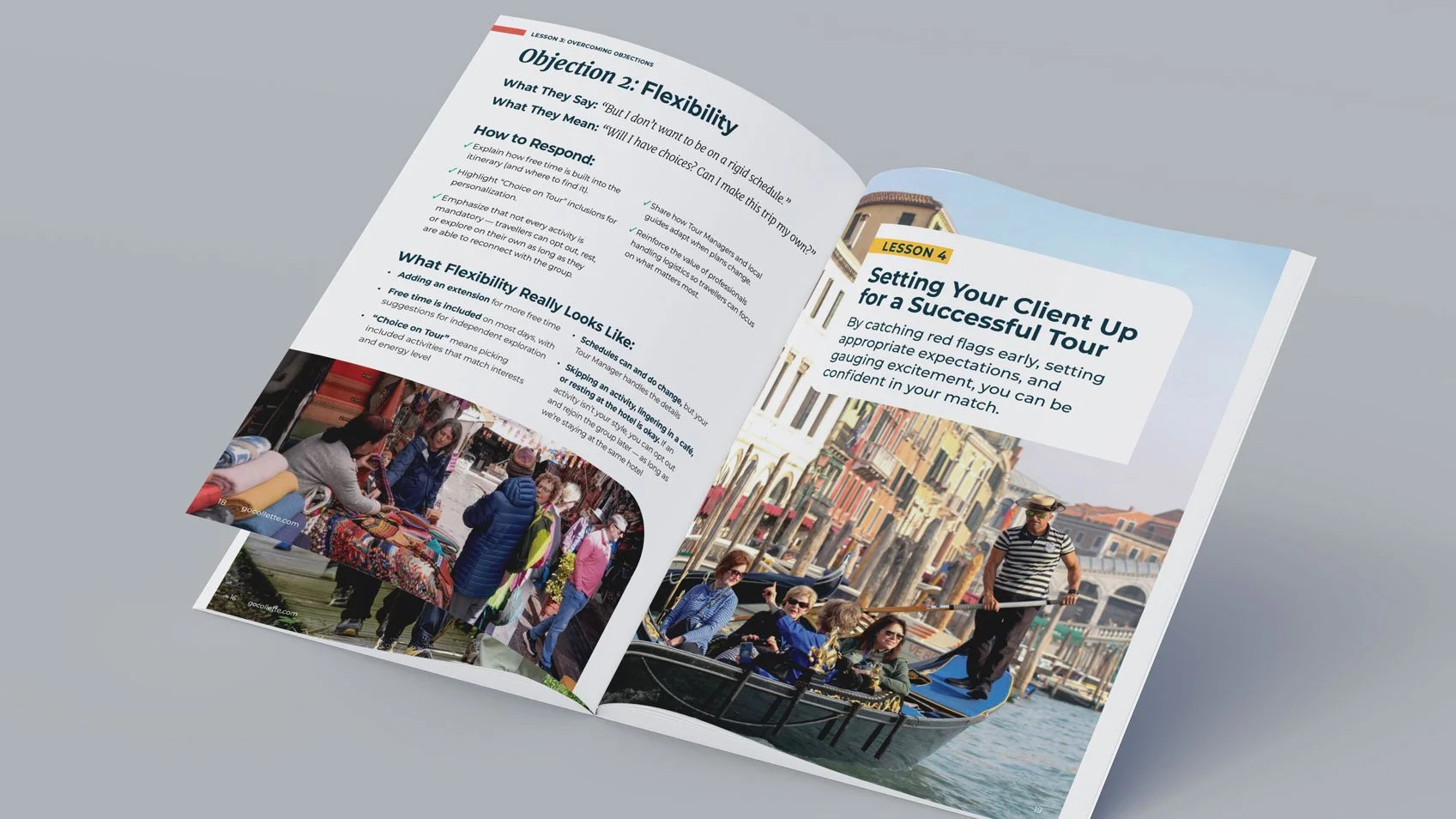
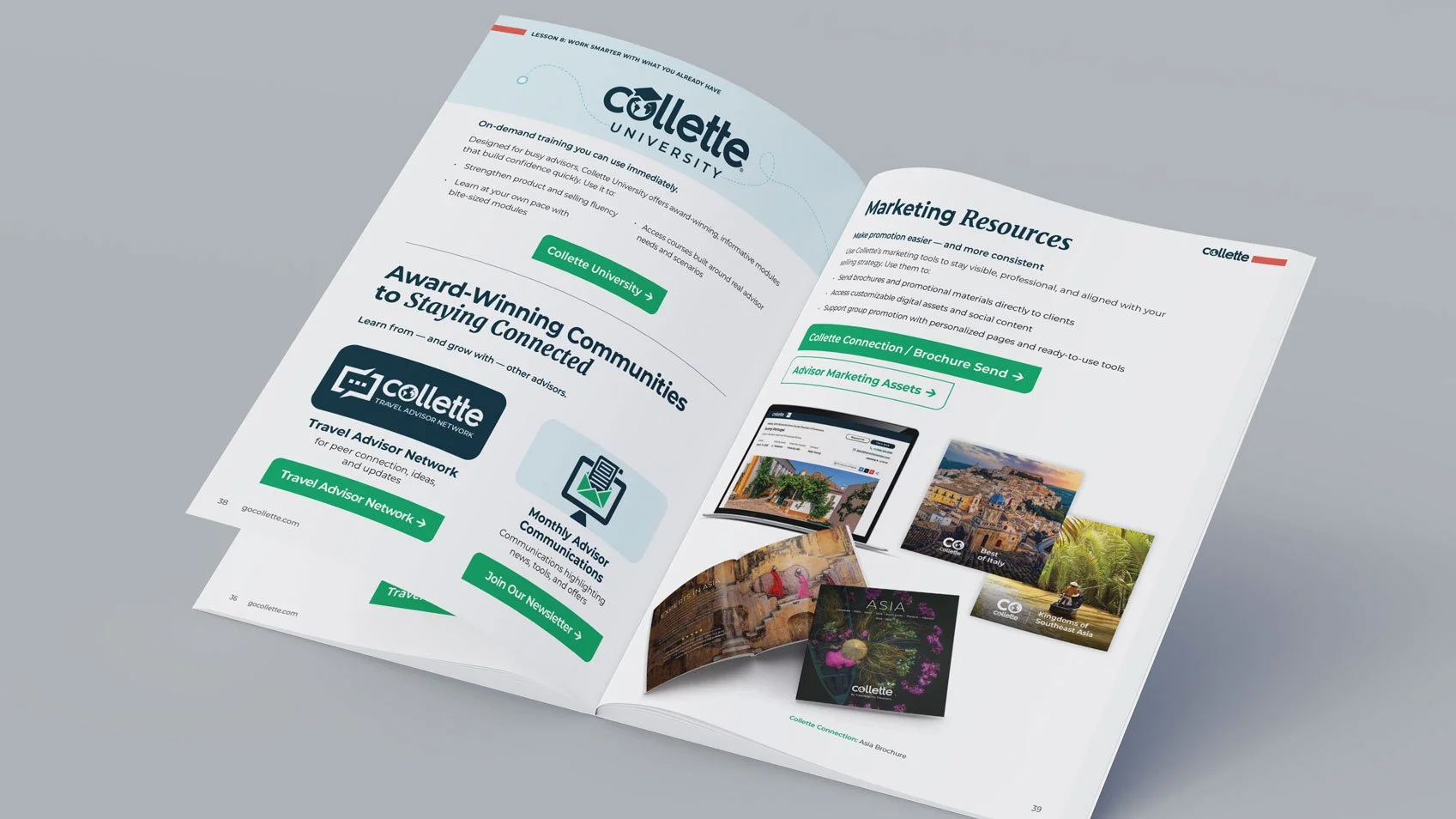
Collette | Advisor Suite, Part 2 — The Selling Playbook ("How")
The goal: The Playbook is the "how" companion to the Resource Guide's "what." It had to take the softest, hardest-to-teach parts of an advisor's job — consulting instead of selling, handling objections, matching a client to the right kind of trip — and turn them into something an advisor could use on the very next client call. The design challenge: keep a lesson-heavy coaching book from reading like a textbook.
My role: As Collette's sole B2B designer, I designed this net-new, 47-page playbook end to end — every page layout is my own, built on the shared Collette design system so it reads as a true companion to the Resource Guide. I designed the lesson framework, the page system, and the supporting illustration, including a recurring advisor character I created in Adobe Firefly.
The approach: I built a modular lesson system — numbered lessons and steps with consistent tabs and repeatable spread layouts — so any strategy is easy to find and the book scales without feeling monotonous. I shifted the voice from the guide's premium register to a friendlier, more energetic one to fit a coaching context, proving the brand could flex tone by purpose while staying unmistakably Collette. A recurring advisor character, generated in Adobe Firefly, runs through the book as a friendly guide that softens dense content. Most importantly, I turned abstract selling skills into tools an advisor can act on at a glance — objection-handling laid out as "What They Say / What They Mean / How to Respond," and Collette's five travel styles as quick-match cards — so the page does the work instead of asking to be studied.
The impact: The Playbook launched as a digital piece during a Collette virtual event and was received so well that advisors began requesting a printed edition to hand to clients — demand strong enough to carry it from screen to press.
Details: Designed in InDesign · 47-page digital playbook (print edition requested by advisors) · Companion to the Travel Advisor Resource Guide · Recurring character created in Adobe Firefly


Grammarly | Higher-Ed Thought-Leadership Ebook
The goal: Position Grammarly as a genuine partner to higher education — a piece that names the real pressures universities face and points to credible responses, without reading like a product pitch.
My role: I designed the ebook end to end — grid and layout system, typography, data callouts, and cover — translating a dense strategy narrative into something that reads fast and unmistakably looks like Grammarly.
The approach: I built a flexible grid so body copy, pull quotes, and stat callouts could alternate and keep the pace up across the full read. I worked within Grammarly's brand system but gave the document its own editorial voice, and designed the data callouts so a skim-reader still walks away with the argument.


Spectrum Enterprise | Integrated Higher-Ed Campaign
The goal: Show campus IT leaders how Spectrum Enterprise's services — high-speed internet, DDoS protection, and cloud security — solve real problems for college campuses, in language a decision-maker actually reads.
My role: I designed the ebook as the anchor of an integrated campaign that also included an infographic and a fact sheet, holding one visual system across all three so the story stayed cohesive wherever a prospect entered it.
The approach: I turned technical product capabilities into benefit-led spreads, used consistent iconography and a restrained enterprise palette to keep dense security content calm and credible, and paced the read with diagrams and callouts so nothing felt like a spec sheet. Every asset shipped as a tagged, accessibility-compliant PDF — a compliance requirement I owned across the campaign.